


Building a hub for estate planning
Epilogue is a platform that helps people create a will online. As the sole designer, I tasked redesigned the Documents page so that users could navigate the estate-planning process with clarity and confidence, while also improving key business metrics.
My designs shipped 100% and led to:
- 20% increase in payment conversion
- 15% increase in customer satisfaction
Role
Lead Product Designer
Duration
8 months
Type
Web app
Responsibilities
Product Scope/Shaping, Competitive Research, Wireframing, UI Design
The Problem
How might we redesign the Documents page so that users can understand and navigate the estate planning process with confidence and clarity?
As a new member to the team and sole designer, I collaborated with leadership (COO & CEO) learning about the product/industry/competitors, gathering business requirements, and understanding pain points relevant to my product area.
Current State
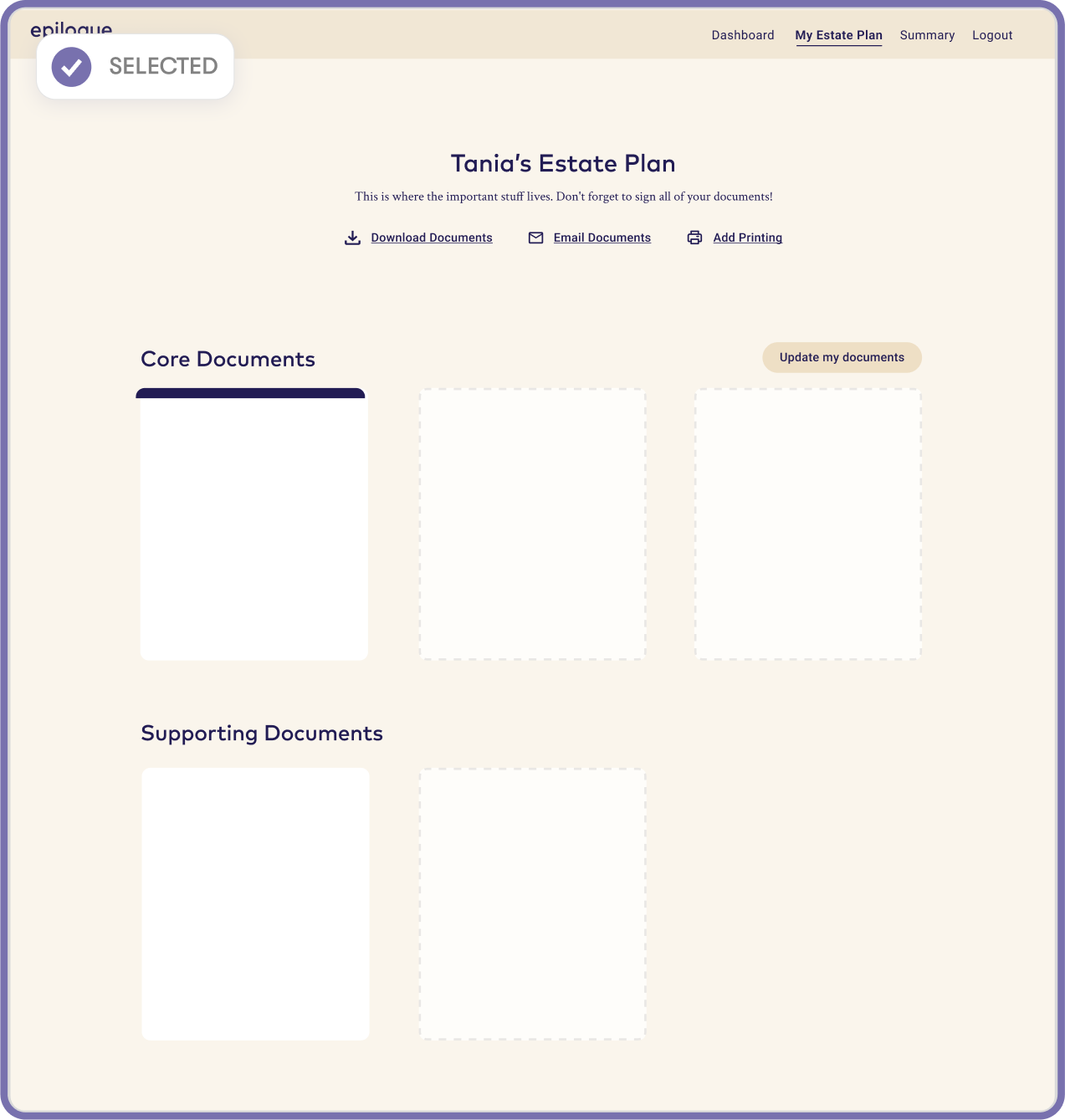
What can people do on the Documents page?
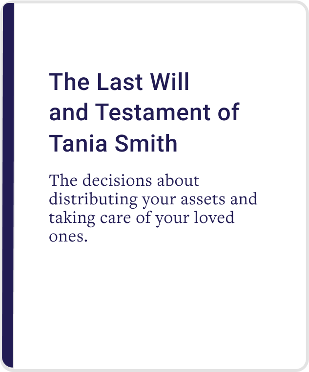
The Documents housed 3 core documents and allowed users to:
- Update their documents based on changes to personal information
- Download core documents for viewing and personal keeping
- Batch print and email all completed documents
I conducted an audit using Neilsen heuristics to understand gaps in the current My Documents page experience and design.
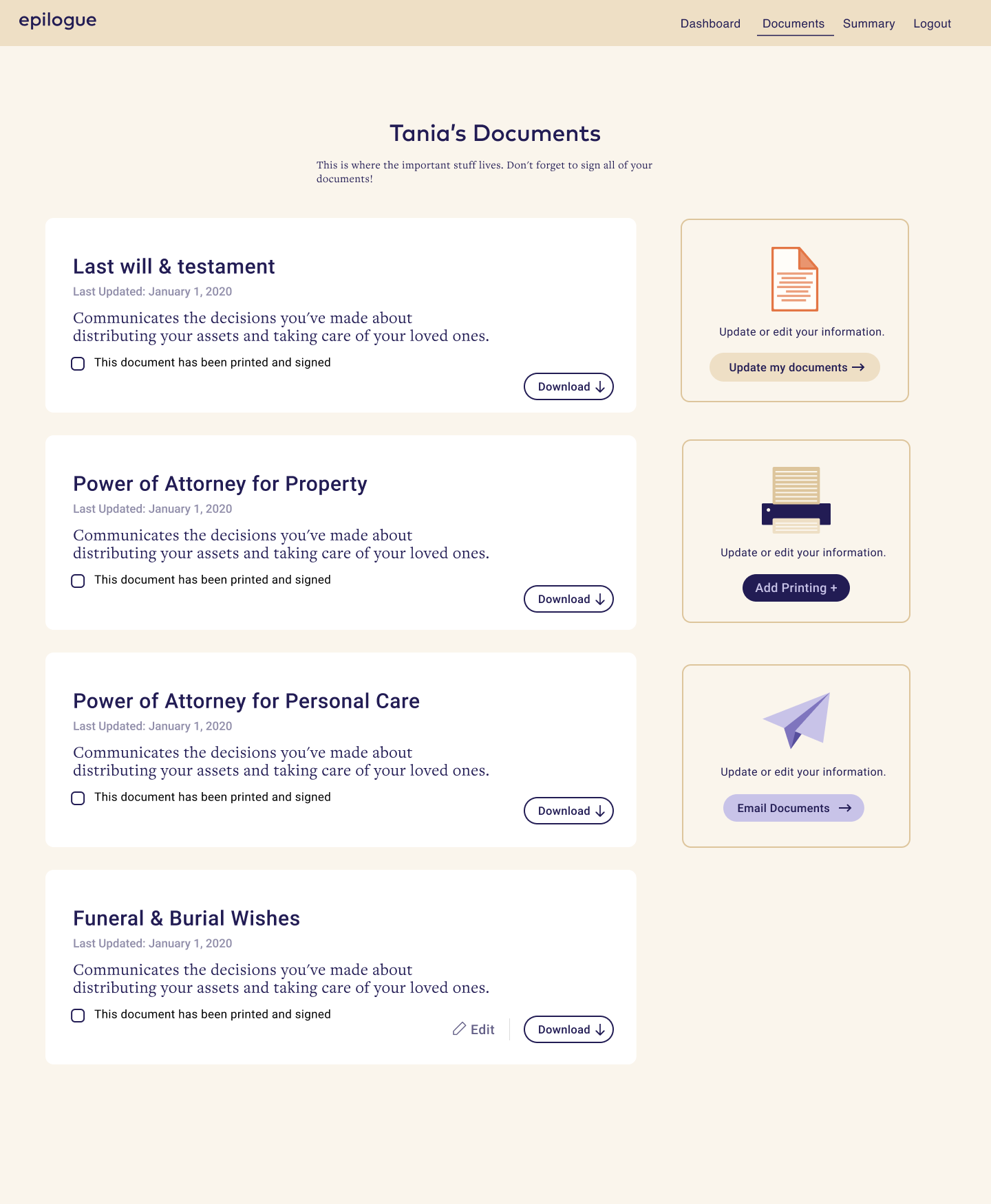
Secondary Actions
Icon, card layout, and description are space-inefficient. Mismatch between size and importance.
Column is not sticky - as user scrolls through documents, they lose visibility & access. Actions are applied to all documents at once.
Card design
Cards have limited actions available, unclear status and lengthy description. There’s a lack of differentiation between document types (Core and Supporting).
Page layout
Columned layout and horizontal card design lacks scannability as # of documents grow. Lack of card groupings based on document types.
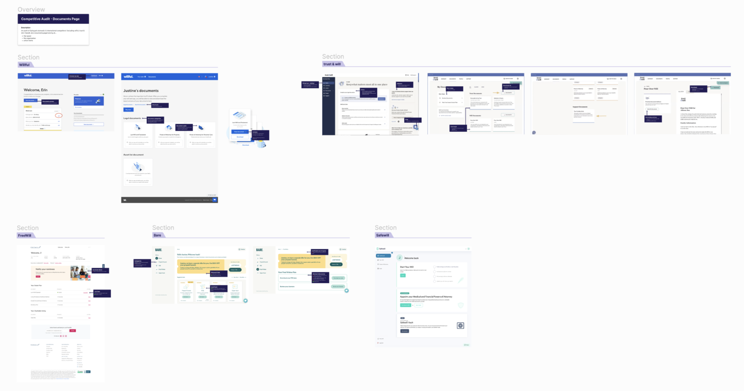
Competitors
I scoured through 6 domestic and international competitors focused on layout, file organization, and action item design. Minimalist card design
- Cards maintain 1 primary action
- Clear next steps
- Clear document progress status
* Became an asset that is used by the rest of the team
Let’s summarize
Based on insights, I distilled 3 project goals:
Optimize task completion
Expand utility of Documents page; reduce friction in completing necessary actions.
Improve organization
Enable easy discovery and navigation; ensure layout scales as # of documents grow.
Simplify process
Make progress visible, status clear, and next steps intuitive to reduce cognitive load.
Given what I learned and defined, I approached the design with the following principles.

Trust
Visual design, copy, and affordances needed to convey reliability.

Accessibility
Broad user base. Designs should be clear, responsive, and readable.

Scalability
Ensure the component & layout design could extend to new document types and actions.
Goal 1/3
Optimize task completion
The documents card was iterated upon several times to land on the final iteration.
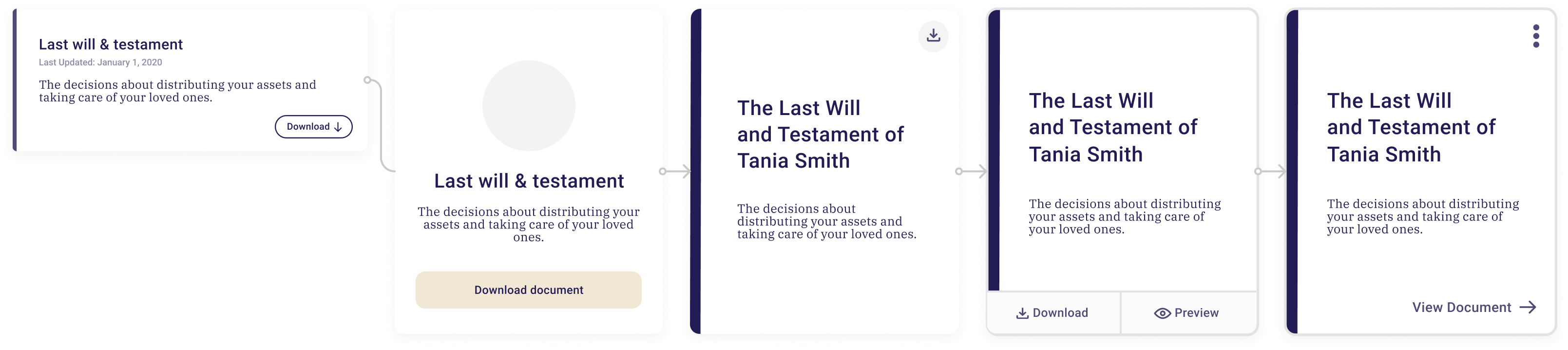
Vertical card
- Greater scannability
- Greater discoverability of other document
- Aligns with user mental model
Stripe accent
- Colour corresponds with document cover
- Consistent design pattern across product experience
Contextual menu
- Greater functionality
- Scalable as # of actions grow
- Reduces clutter
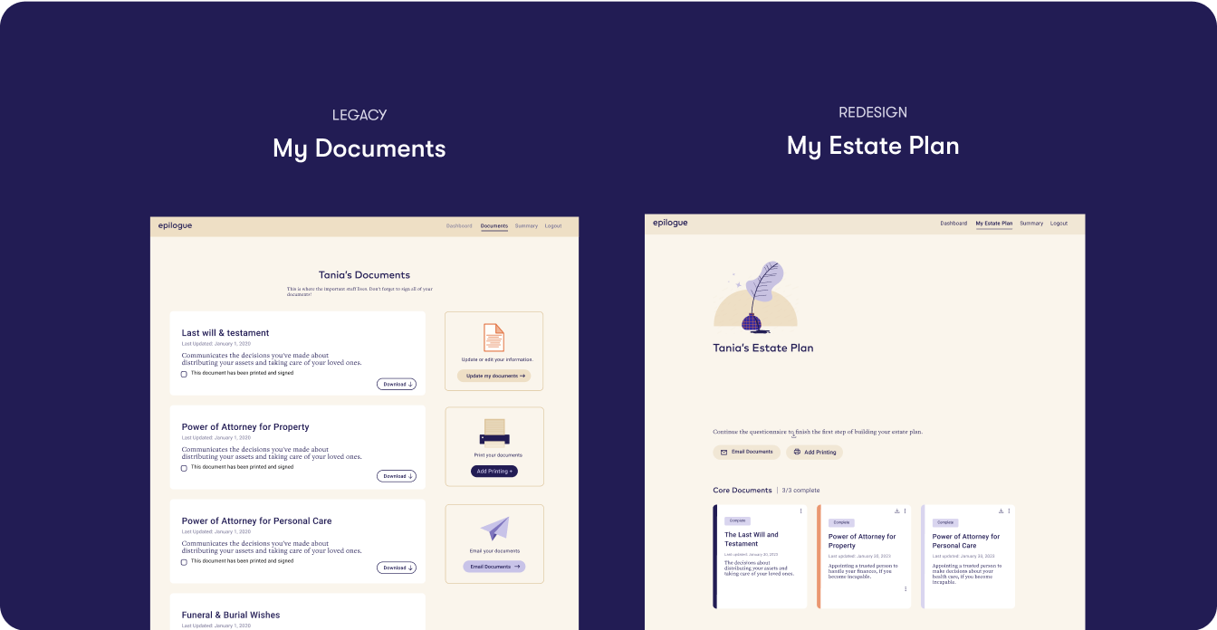
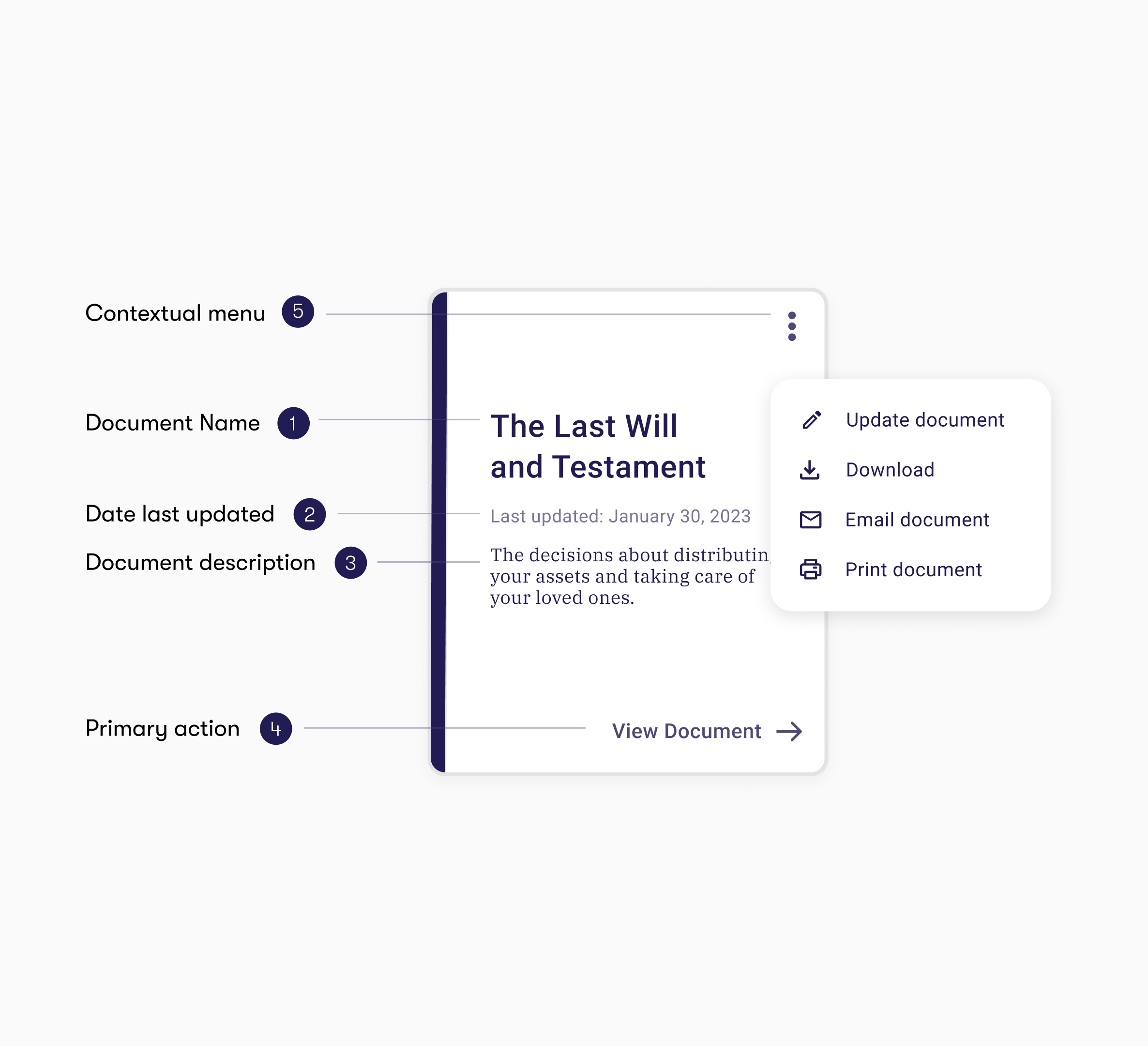
Final card design

Minimalistic and intuitive copy and design
Clear and consistent visual hierarchy
Greater document-specific functionality
Visual differentiation between document types
Goal 2/3
Improve document organization
Transitioned from multi-column / scattered secondary actions to a single column layout with a fixed, top-bar for global actions. This improved discoverability and reduced visual noise as document count grows.
Double column & sidebar actions
❌ Cards are less scannable
❌ Awkwardly fits 3 cards
❌ Secondary actions take up a lot of space
Single column & top bar actions
✅ Cards are more scannable, documents more discoverable
✅ Space efficient
✅ Scales as document number grows
✅ Secondary actions are given less weight
✅ Responsiveness
Goal 3/3
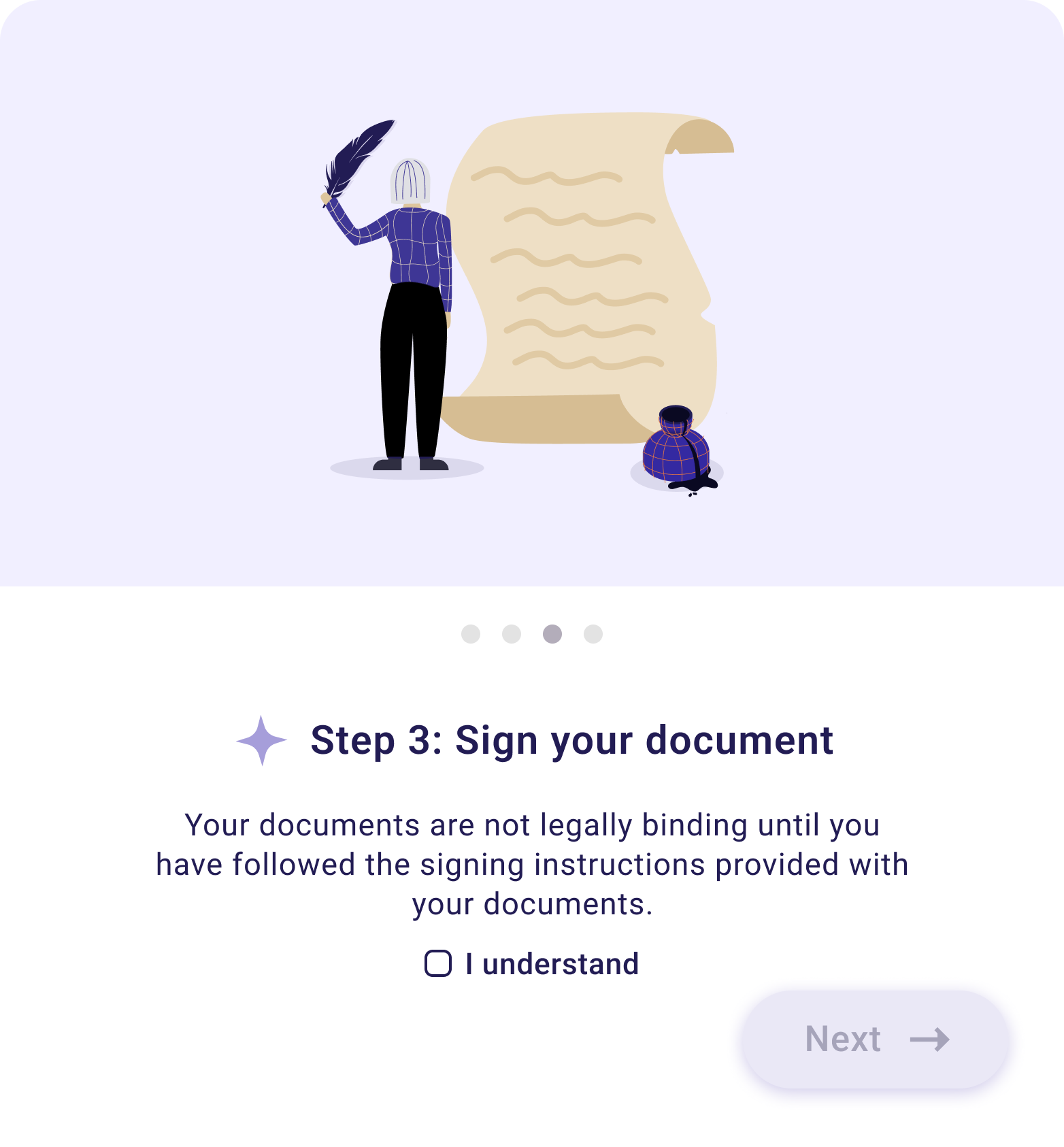
Simplify users through the estate planning process
I audited the high-level experience from starting on the landing page to getting full access to their will. From this, I created a user flow to depict stages in the document creation process.
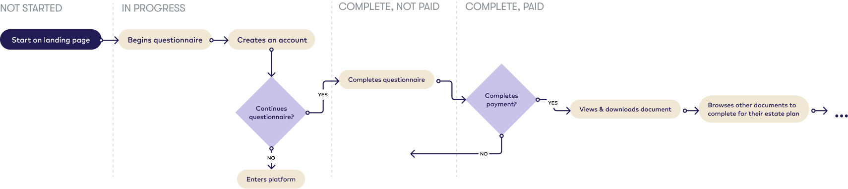
Document states
The only difference between states were CTA and button style. There was an opportunity to promote completion & payment.
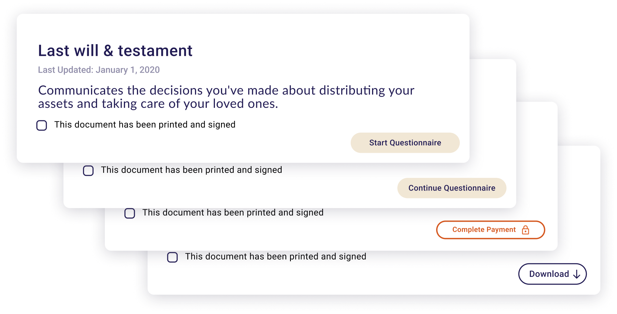
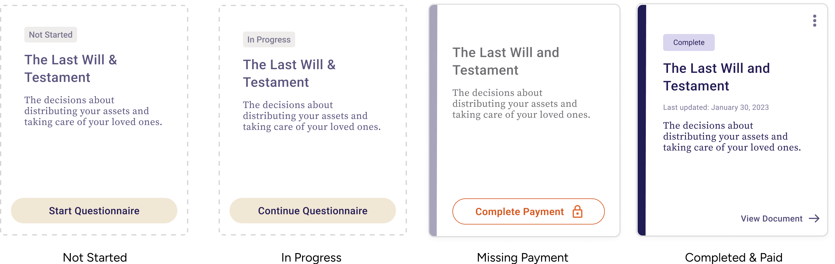
Adding status indicators
Added status tags, completion tally, and visually prominent “complete” / “incomplete” states to help users understand where they are in the process, and what needs doing next.
My impact
Upon shipping the new design, we monitored key metrics (questionnaire completion rates, account creation to payment conversion, and customer satisfaction) for 4 weeks to understand the impact of the redesign.
The scalability of the design lends itself to future product offerings.
+21%
in payment conversion
10
in CSAT


